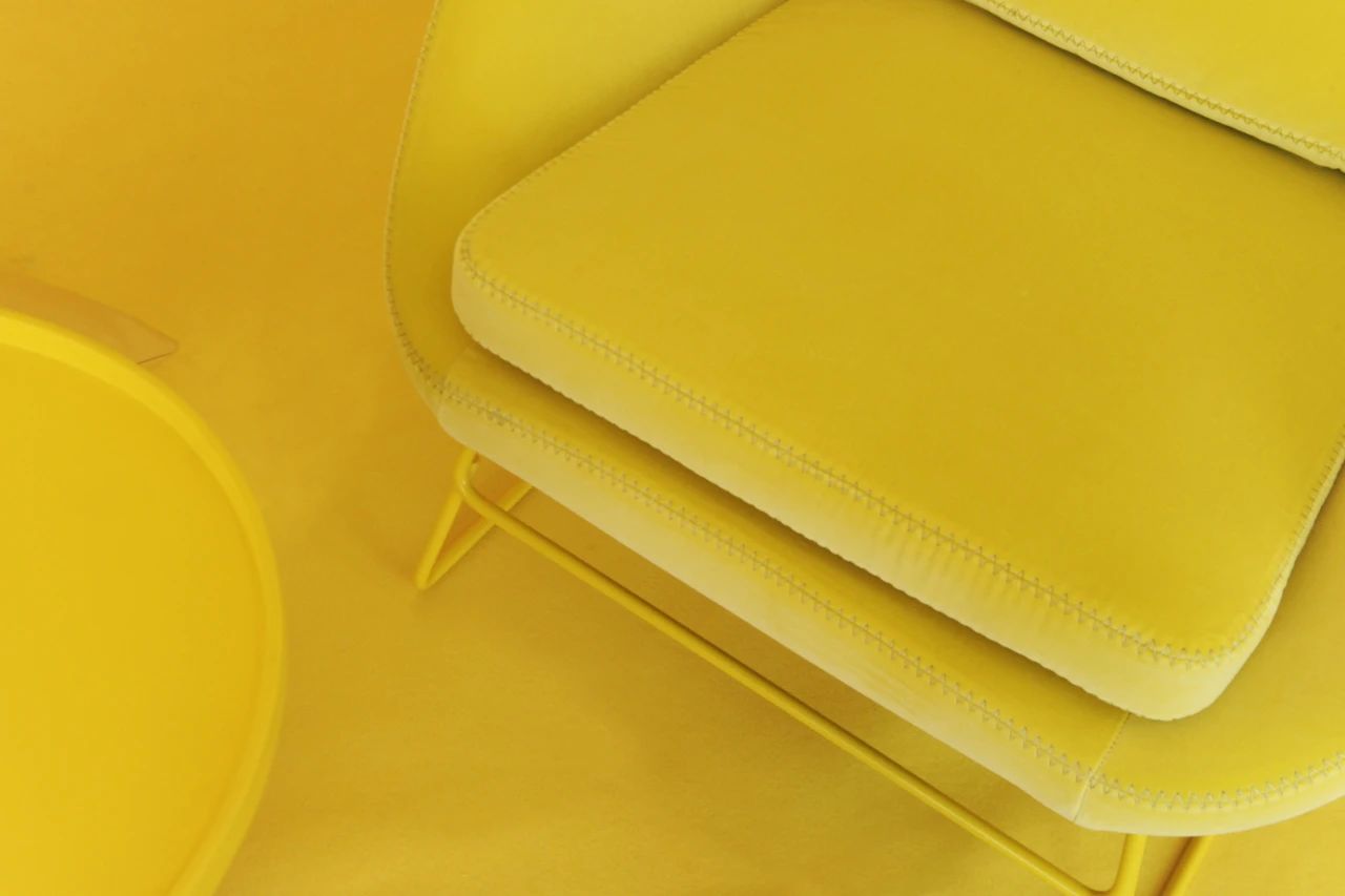
"Dialogue on Color" at Sheshan Aesthetic Space
Extension: June 5, 2021 - June 5, 2022
Time: 10:00-18:00 from Tuesday to Saturday every week
Address: No. 1178, Linyin New Road, Sheshan, Shanghai
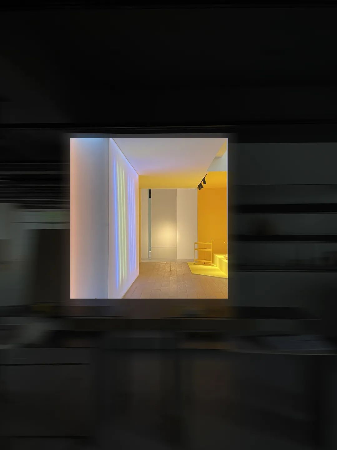
The influence of color on us makes it extremely important in space design and furnishing. In addition to contributing to the creation of the overall space, choosing the right colors also plays a role in showcasing personality and lifestyle. We can also view "color" as a relatively simple design method, through which anyone can easily and simply create a unique spatial atmosphere.
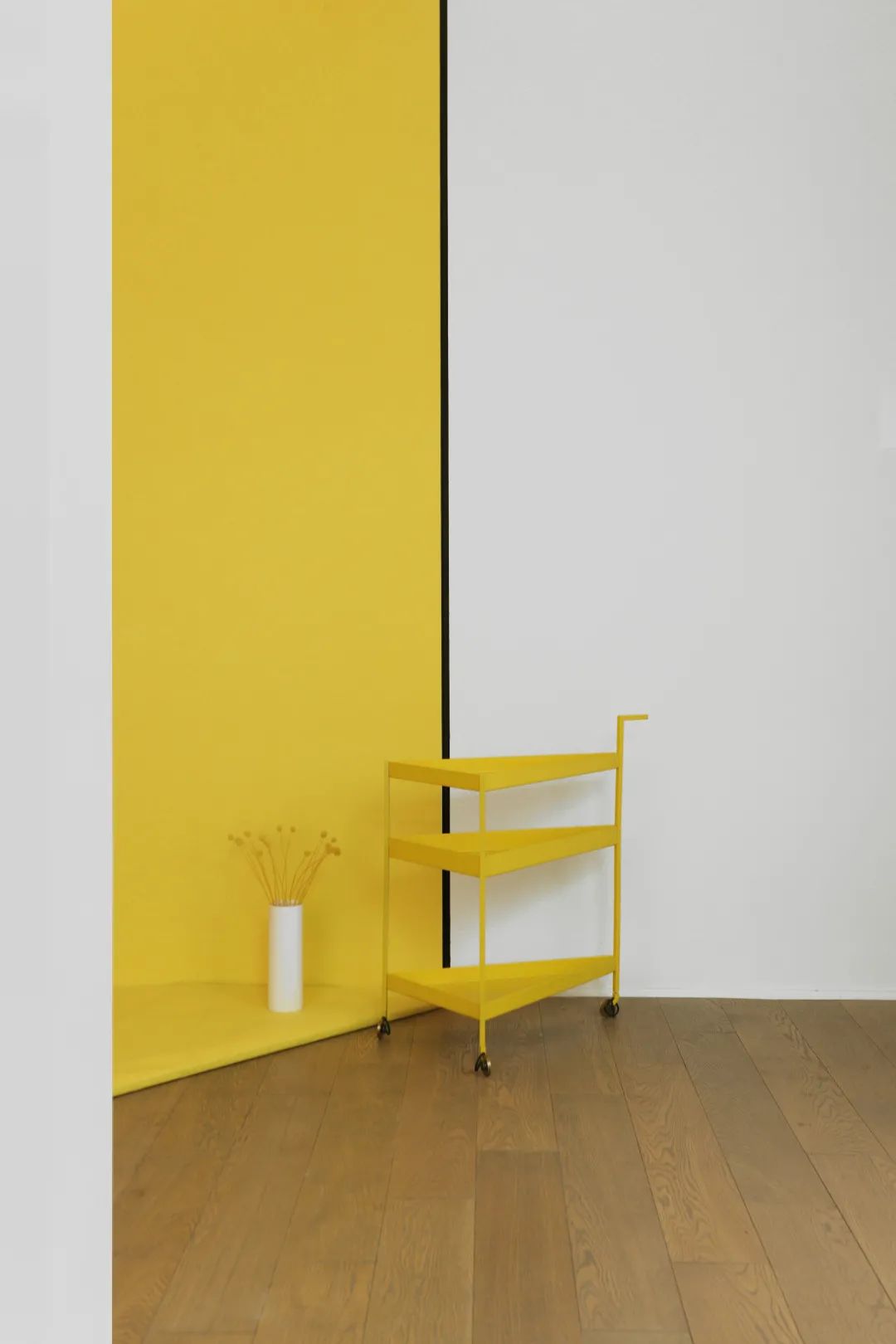
ow to use colors to create emotions and depth? Bright and eye-catching colors can enhance the visual experience of the space through matching, making the room harmonious yet not dull. For instance, cool tones such as blue, green and purple are in a low position and are usually associated with relaxation, tranquility and comfort, while warm colors like yellow, red and orange are more capable of activating the senses and attracting attention, and are typically related to energy, brightness and movement.
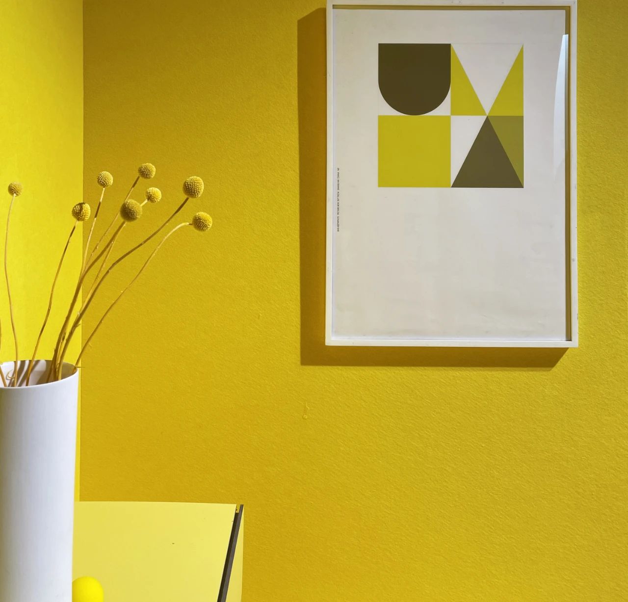 Among numerous design elements such as lines, structures, and textures, color possesses the absolute ability to effortlessly transform space and evoke emotions. Each color can profoundly convey completely different emotional feelings.
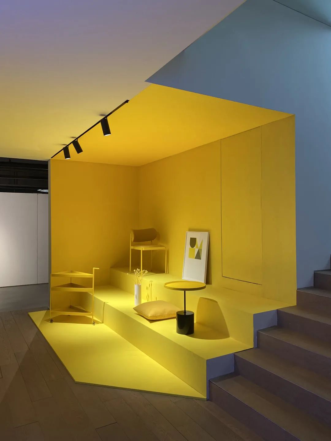 Annual fashion trend: Bright yellow. The COLOR DIRECTION series, determined by lines and "pure" colors, is a thought inspired by modernism. Charlotte Perriand and Josef Albers draw inspiration from the color principles established by these masters. As the most relevant medium in design, color has unlimited potential。
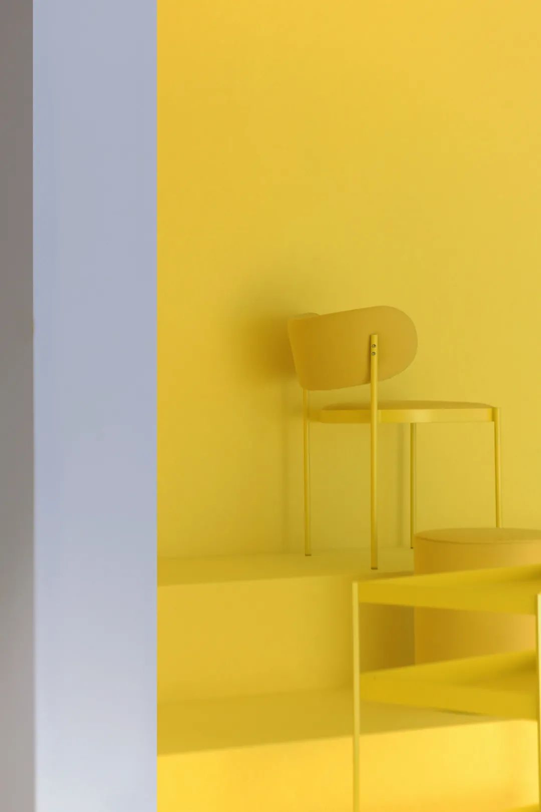
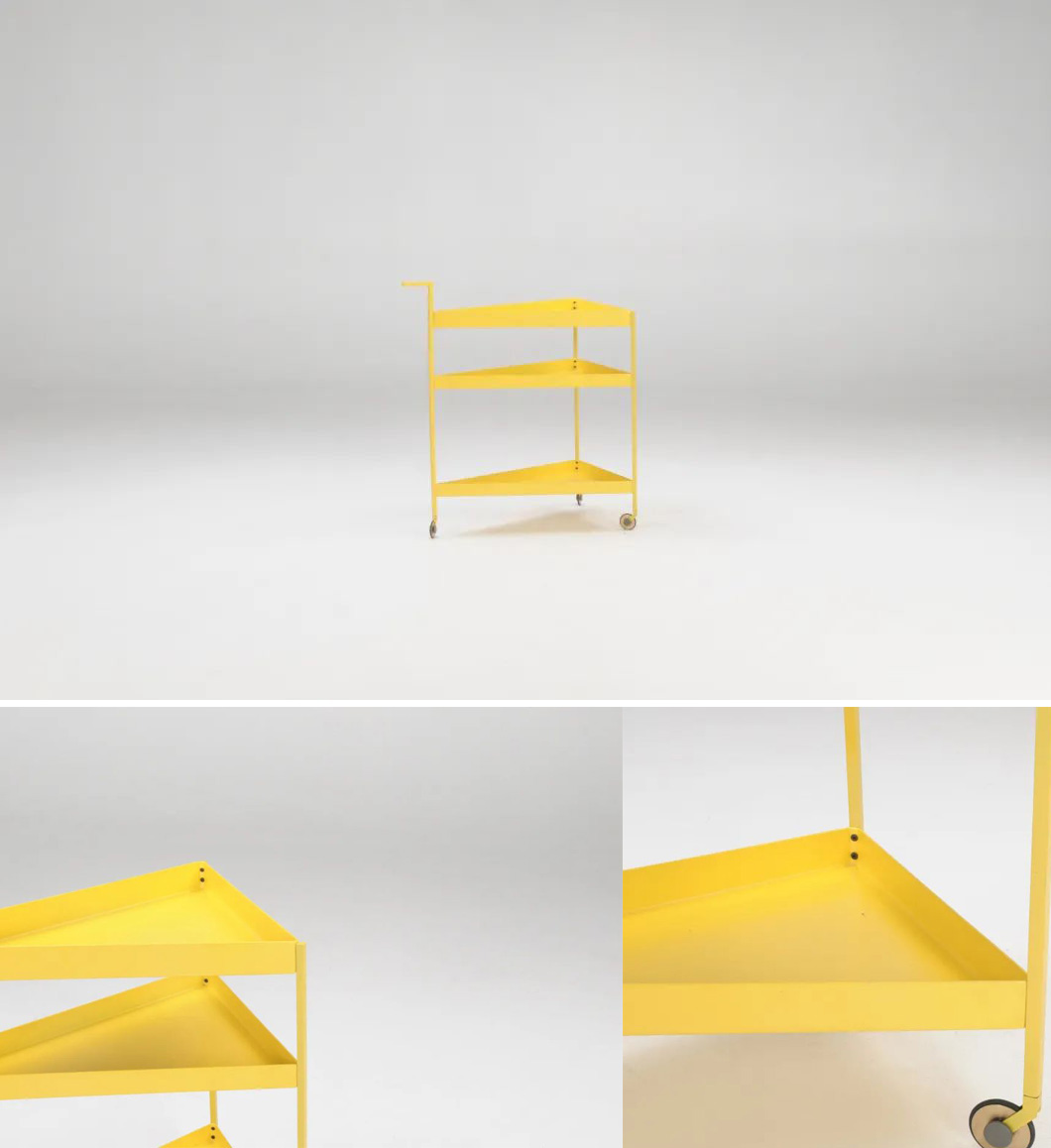 THEBHS Bauhaus understands the powerful force that color possesses in inspiring space and defining feelings. Therefore, in the 2021 annual trend special topic, the designer carefully selected exclusive color matching solutions, using different colors to interpret new styles and experiences. The gameplay of splicing colors and lines further reveals a playful and candid inner world.
Why bright yellow?
Optimism in design: One of the reasons why designers choose bright yellow is its boldness, loudness and liveliness. For designers obsessed with popular elements, yellow is an ideal choice, as it offers the flexibility to perfectly match various color schemes and design styles. "Yellow" is the most vibrant color in the spectrum and is also the easiest to be processed in the optic nerve. Therefore, compared with other colors, yellow attracts our attention for a longer time. It is often regarded as the color spectrum most closely associated with optimism and happiness. In almost every culture, this bright color represents vitality, joy and warmth. Using bright yellow as a new perspective to drive spatial inspiration symbolizes energy. Create a more dynamic visual form to keep the living space diverse.
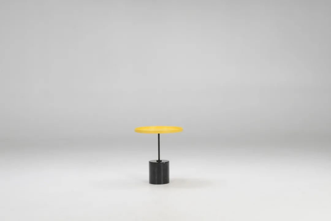
Reduce complex details and create choices that are both traditional and contemporary in beauty. -THEBHS Bauhaus 